While traditional kitchen styles tend to emphasize material and color palettes, modernist designers are exploring the world of unconventional geometric design and creative framing. The kitchens in this post range from futurist styles based on sharp asymmetric polygons, all the way to otherwise classic compositions that break the mold by emphasizing innovative uses of proportion and shape – bold and subtle in turn. Many of these spaces sit on the high end of the luxury spectrum but others employ simple tricks that any handy DIY enthusiast can use. Which modern kitchen is your favorite? Let us know in the comment section!

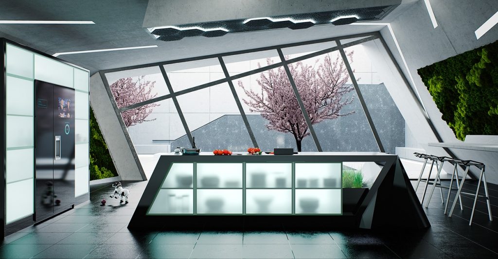
Let's start with something totally out of the ordinary. This kitchen builds off uniquely angled architecture with a trapezoidal island. The result is a surreal environment that turns spatial perception on its head.
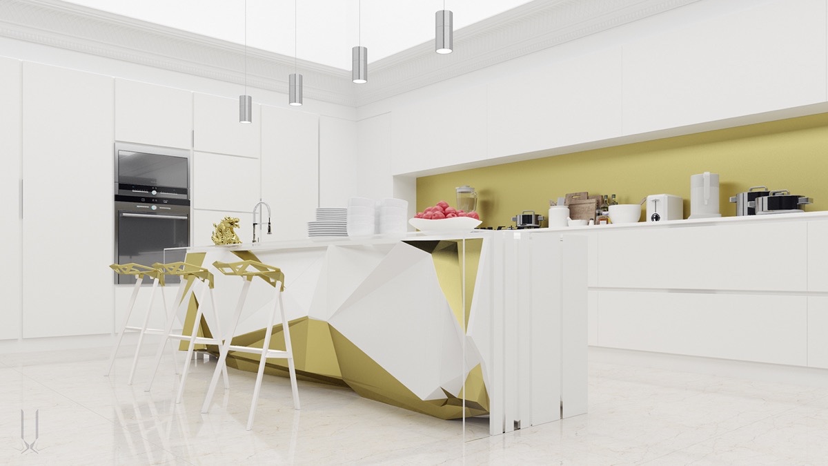
While the rest of this kitchen enjoys the clean lines of an ordinary modernist style, the chaotic folded angles of the island pack a strong futurist punch. The unique kitchen bar stools are a perfect complement.
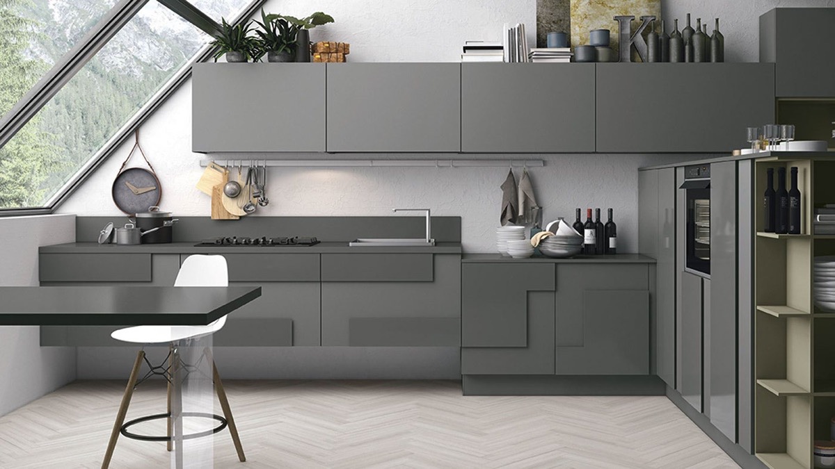
Gorgeous! L-shaped cabinet faces bring this kitchen design to the next level. Variations in texture and depth bring life to the otherwise simple surfaces.

Here's another kitchen that carves character into ordinary features. The color palette is classic, but the distinctive shapes give the cabinetry a perfectly contemporary attitude.
Unconventional geometric designs are a fantastic way to create a focal point within minimalist compositions. This angled kitchen island and breakfast bar combination offers striking contrast to the clean lines that dominate the rest of the interior.
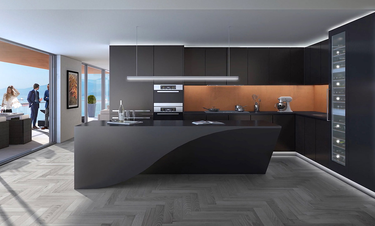
This smoothly tapered kitchen island plays with light and shadow for a fluid and seamless effect. It's a functional sculpture sure to leave a lasting impression on guests.
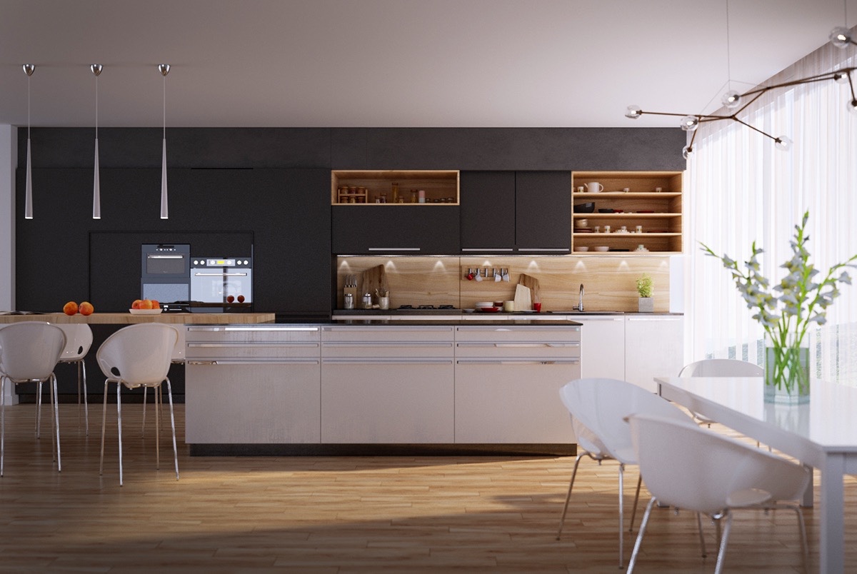
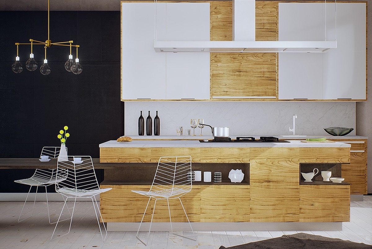
Designs that employ carefully considered geometry can be subtle as well. This one uses wood and contrast to strike a sense of balance between the cabinetry and the staggered island in the foreground.
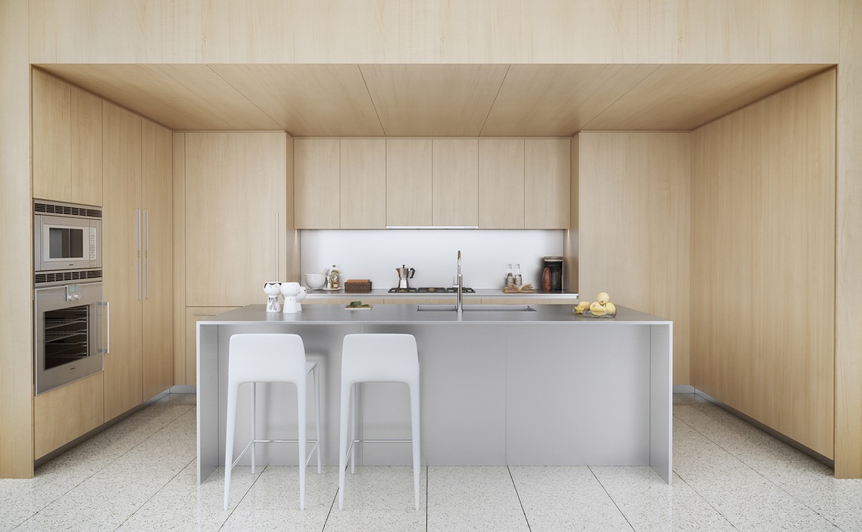
Symmetry and contrast play an important role in this kitchen. Even the refrigerator uses matching wood cladding for a seamless design.

How cool is this? Cabinetry yields to small windows that allow a look at the contents, an interesting alternative to the more typical open shelving approach employed with the spice racks in the back. But having an open approach like this means that every one of your accessories on display - including knives, wine glasses, mugs, cutting boards, teapots, cookie jars, etc. - need to be on point.
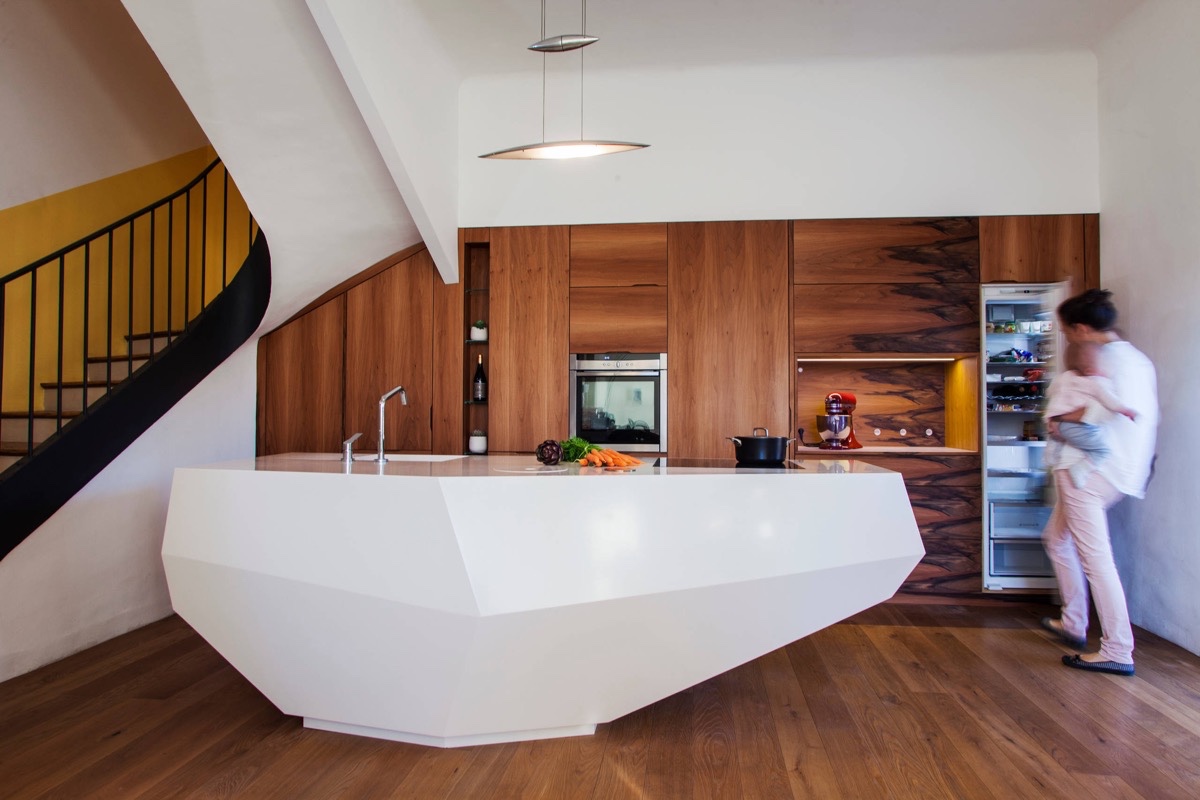
A curvaceous staircase and sharp iceberg shaped kitchen island are a match made in heaven. The contrast between modern white surfaces and traditional wood cabinetry adds even more depth to this unique kitchen design.

Retro and contemporary accents come together in perfect harmony. The unconventional geometry is fairly easy to overlook, consisting of creatively arranged upper cabinets and the careful use of repetition. The indoor herb planter rack lends a nice green touch.
Balance is such an underutilized aspect of kitchen design. This one uses wood elements straddled on either side of the tall cabinets, with horizontal and vertical lines reaching a beautiful equilibrium.

Faint patterns on the grey cabinet faces, nested rectangles, and a sharply trapezoidal range hood are just a few of the features that speak to a low-key appreciation of creative geometric composition.
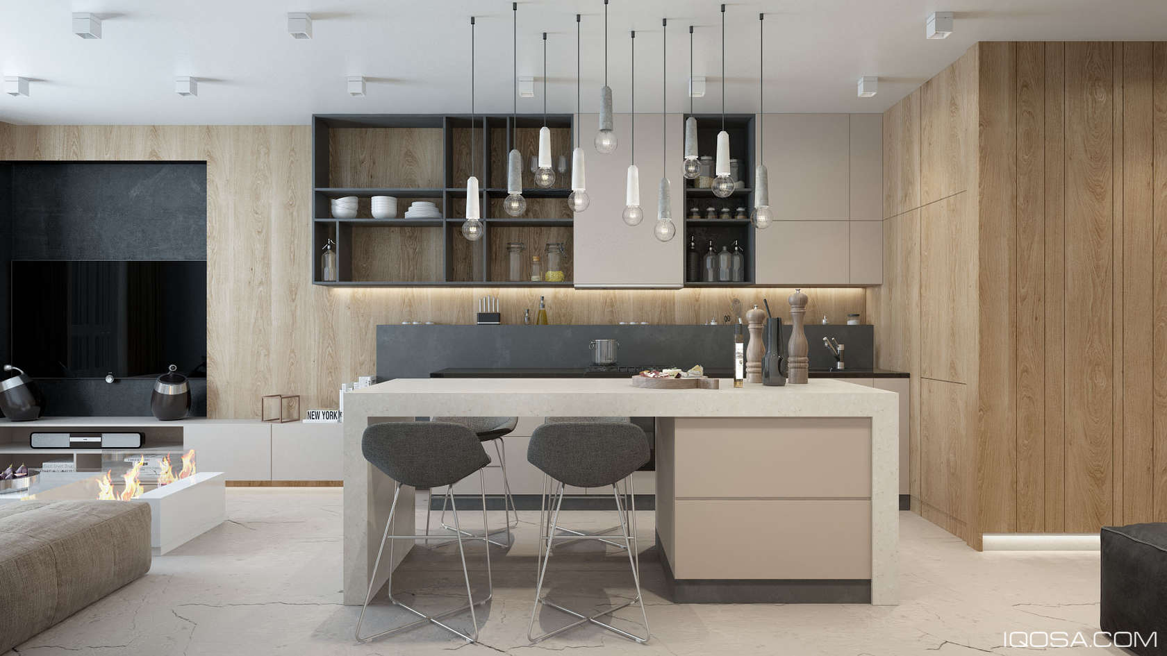
Heavy emphasis on linear forms defines this kitchen, but the occasional chaotic accent keeps things lively. The distinctive lights above the island are from the AIM series by Ronan and Erwan Bouroullec.

Next up is a series of kitchens that use rather conventional geometric techniques. This one relies on linear forms but shakes things up with curved Eames dining chairs.
This kitchen uses the same curvaceous chair technique as the previous kitchen. This time, rounded kitchen pendant lights further the contrast between the organic and the linear.

Backsplash and cabinetry use vertical lines, while the kitchen island and breakfast table combination embrace the same horizontal grain as the low media table. The rounded chair and light combination shows up again.

Even though this kitchen and dining arrangement may seem universal, other shapes like cones and cylinders define the upper half of the visual plane. The Tolix-inspired stools seem to match the flair of the Aplomb pendants.

Fluid marble veining offers an impressive counterpoint to the rigid lines of the cabinetry and kitchen alcove. Material contrast is always an interesting way to break up an arrangement that feels too structured.
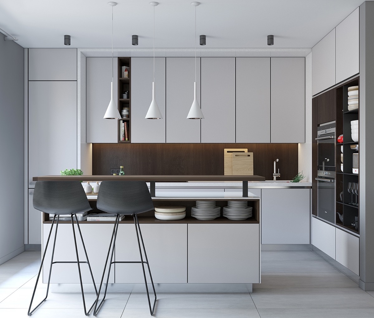
You can't go wrong with clean lines. This minimalist kitchen plays the balance game very carefully. Following the floor tiles and the alignment of top and bottom cabinet, it's easy to see this kitchen didn't abuse symmetry but instead used alignment to create a sense of visual tension that works very well here.

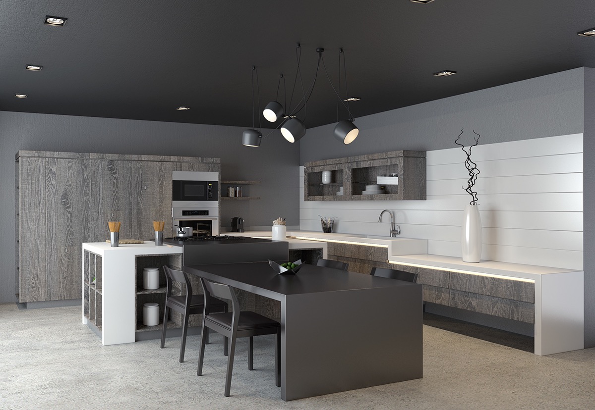
And here's another kitchen that seems very simple at first glance but makes good use of proportion and division to generate visual interest. Dark hues of the round kitchen table provide great contrast to the light kitchen scheme.

Straight lines, curved chairs, and rounded pendant lights will remain a winning combination. Contrasting accents always work wonders to break down boundaries in a kitchen theme.

While this kitchen is extra minimalistic, it takes advantage of the open plan to draw attention to the geometric wallpaper print to the right and the organic wood grain to the left. It's a beautifully pristine buffer zone between the two defining styles within.
Like the skeletons of 3D models, wire form dining chairs embody a geometric attitude by their very nature. These offer a futurist counter to the contemporary and rustic materials behind them.

Vertical and horizontal rectangles make up the geometric fabric of the kitchen itself, but the pendant lights punctuate the theme with their dramatic curves. They're from the Here Comes The Sun collection by Bertrand Balas.
The beautiful Aplomb pendant light makes another appearance in this clean-edged kitchen. The flair of the breakfast stool legs seem to trace the conic forms with ease.

Rectangles, lines, and the subtle curve of the stool seats make up the basic shapes of this minimalist kitchen.

Diagonal stripes are such a rare sight in interior design! These wireframe dining pendant lights are a beautiful sight against their stark charcoal background.

Subtle folded forms let the black dining stools and pendant lights stand out from their background. When confronted with matching shades, the effect of directional light can be a designer's best friend. Do check out our feature on similar black and white kitchens if this theme excites you.

While the sense of contrast brought in by the wooden bar stools and the light colored countertop is undoubtedly the most striking feature of this kitchen arrangement, the layered effect of the rectangular range hood is worth admiring on its own merits.
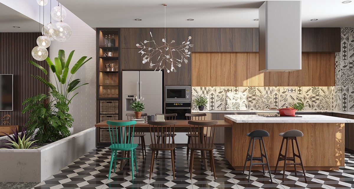
Amazing patterns everywhere! From the floors to the backsplash, and even showing up in the chair styles and pendant lights, this kitchen makes its mark with dazzling tessellations and more. This is an extra fun way to approach an interior style that pays homage to the art of geometry.

The rectilinear dandelion gold kitchen island light doesn't have to fight to stand out from this chocolate brown kitchen. Off to the side, a round pendant light and rug shine a spotlight on the dining cove to the left.

Super simple! This kitchen uses dramatic layering and contrasting orientation to draw attention to the marble backsplash.

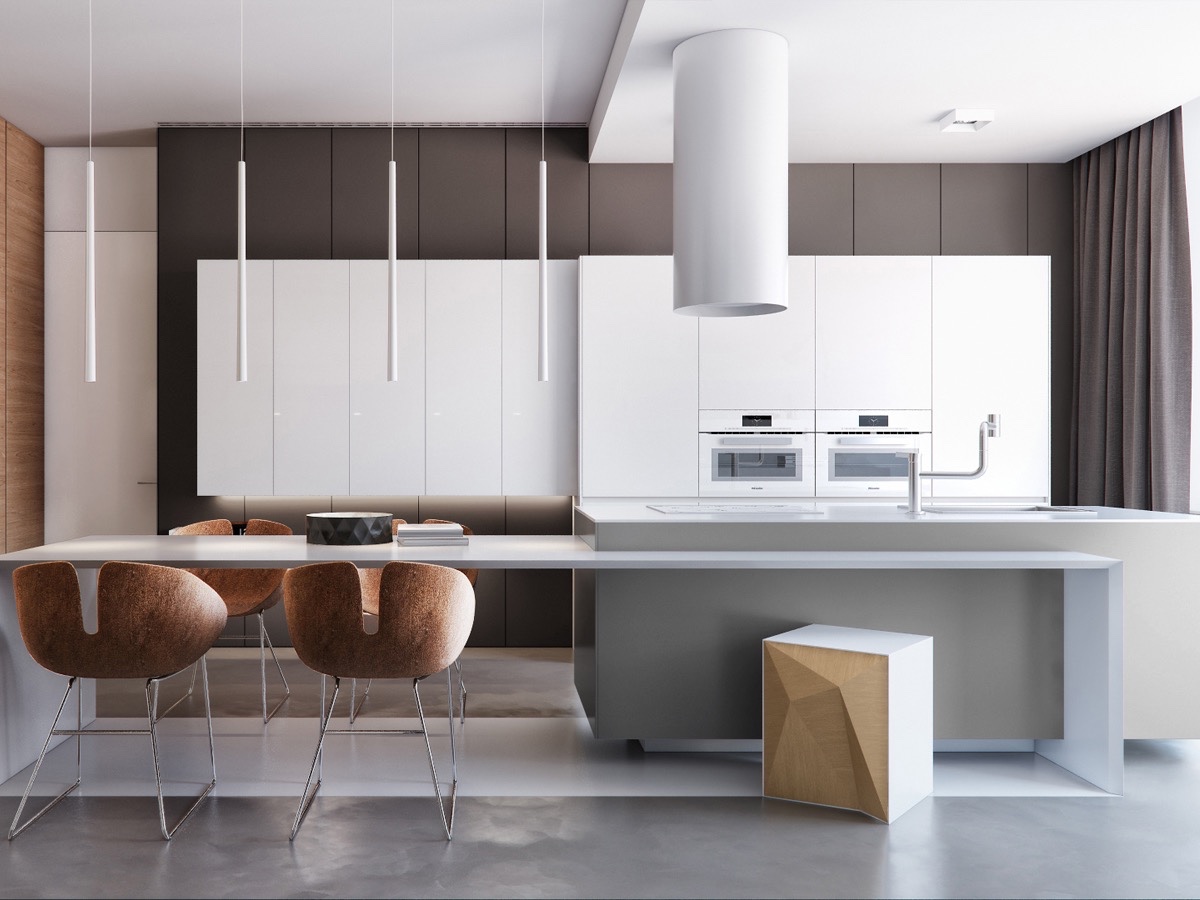
It might take up more space, but an angled kitchen island can completely transform an open plan kitchen. The offset block construction is especially interesting, and the bold woodgrain is incredible!

There are so many things going on with this kitchen. The exposed beams cut across diagonally, with pendant lights cutting through the opposite way – it's a cool and innovative approach to interior architecture.

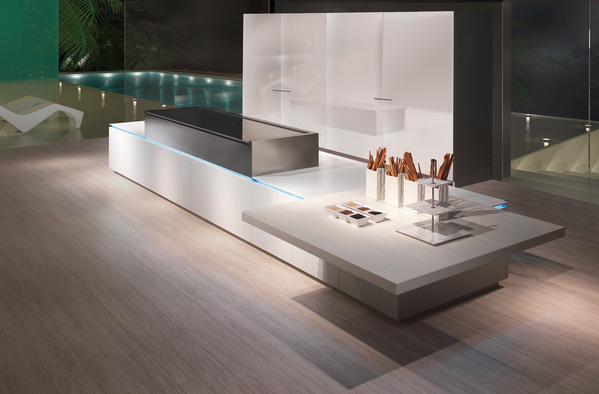
This kitchen island looks futuristic because it really does push boundaries. It includes high fidelity speakers and a panel with buttons to control everything from lighting to ventilation and even the curtains.

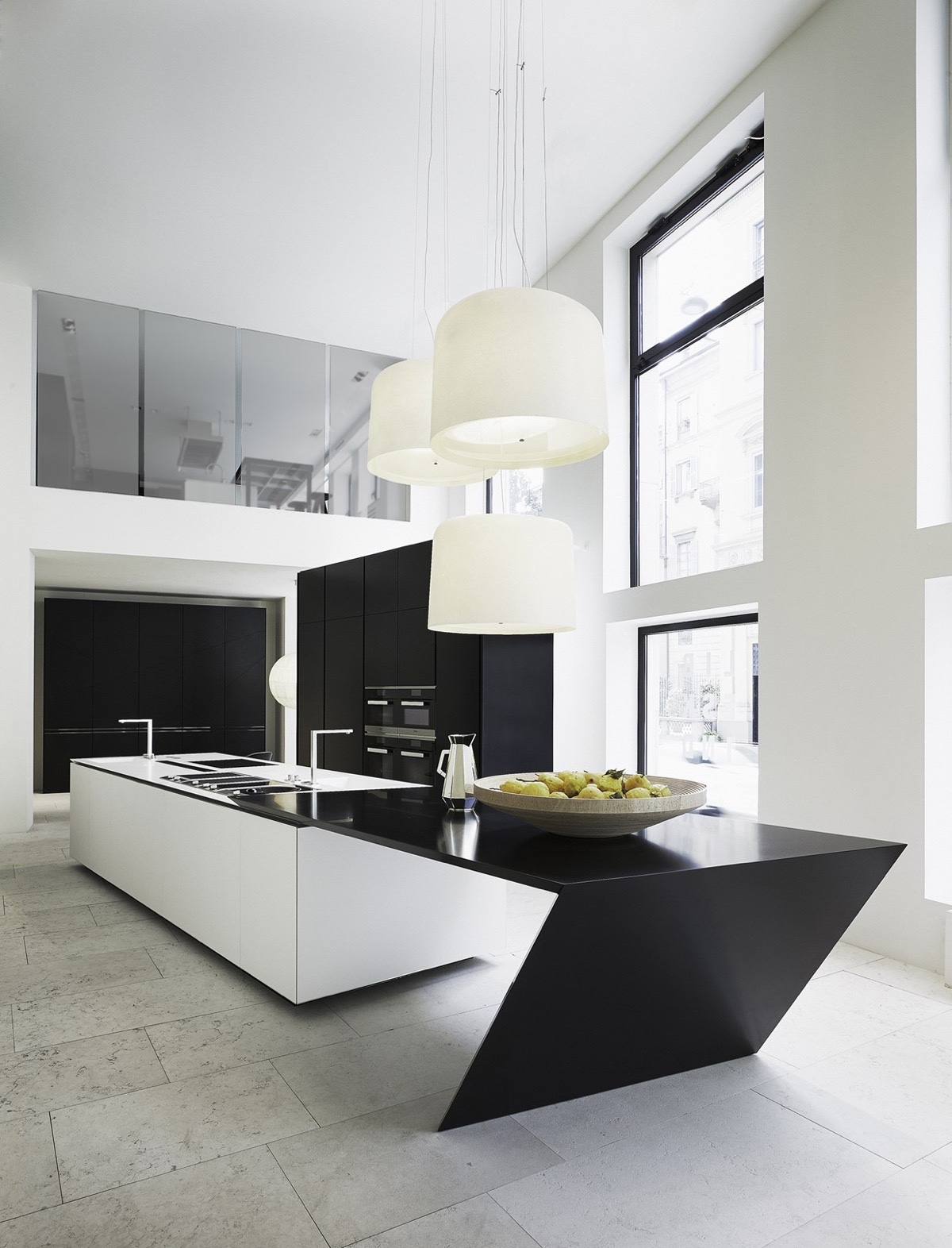
With elegant folds and twists, this island follows the path of the distinctive angled windows to the right. The kitchen itself is sleek and minimalistic, allowing this centerpiece to stand out as a functional sculpture.

Super sleek and well-balanced cabinetry offers a nice contrast to the smooth wooden backsplash. Curvaceous chairs shake things up in the foreground.

Tiles are one of the more affordable ways to add a touch of creative geometry to the kitchen. This herringbone arrangement is easy to accomplish with any long and thin tiles you can find.

Another combination of rounded pendant lights and curvaceous chairs against a backdrop of straight clean lines – it's important to mention that, like the tiles, this approach is affordable and easy to change later.
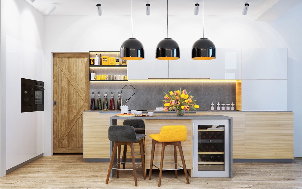
And here it is again! This one also has a bright and sunny color theme for palette inspiration.

Oversized handles bring playfully retro character to the otherwise minimalistic cabinets. Check out the large kitchen clock as well! What a fun look!

Offset squares and rectangles take their cue from the De Stijl art movement, a style that relies on color and contrast and tends to stick with vertical and horizontal lines.
This space proves that a kitchen doesn't need bright colors or dazzling materials to look luxurious. The offset dining table and workspace extension really sets it apart. This setup is made in Italy, available from Scic.
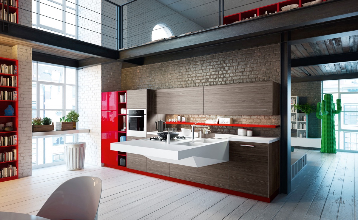
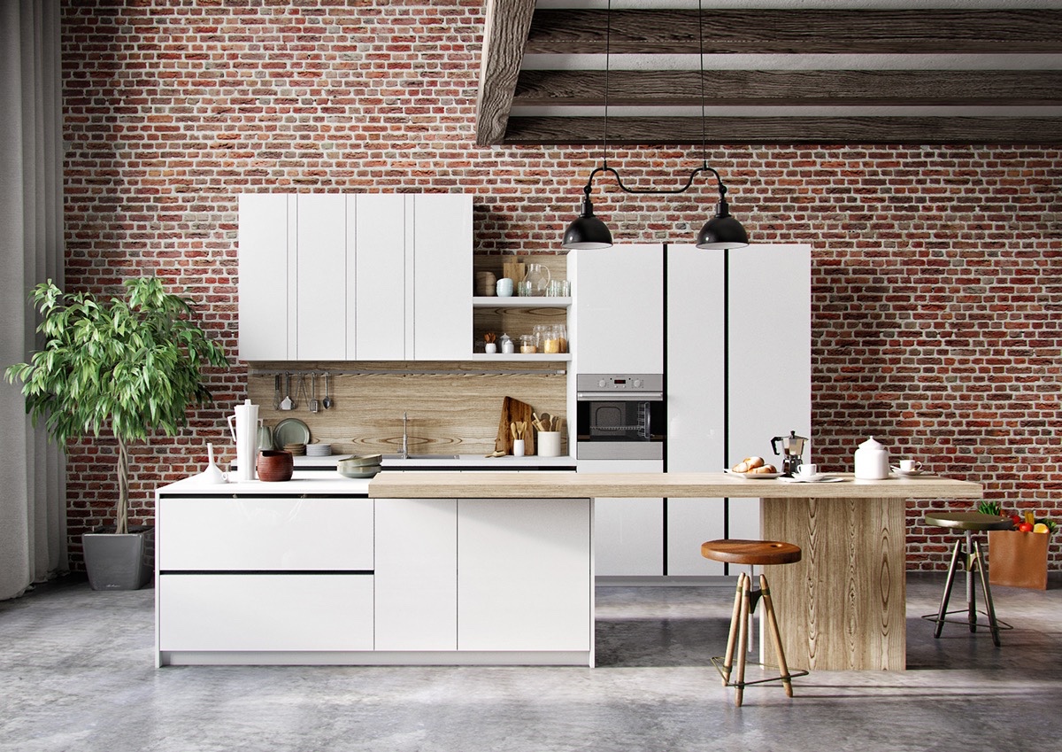
While the brick and wood indulge a love for traditional styles, the white sink and range extension highlight great modern design and sharp geometry.

The oversized angled range hood brings art to the upper half of this futuristic kitchen. The central island seems minimalistic in comparison, but its sharp lines are impossible to ignore.
Offset cylindrical pendant lights and a creative polygonal breakfast stool serve as strong focal points in this strong linear composition.

Straight lines and a cylindrical range hood serve as an unforgettable combination. And just check out the pairing between sky blue and seafoam green! The warm wood tones complete the carefree aesthetic.

Angled ceilings and the curved kitchen island prove a formidable duo. This combination is sure to delight guests, especially with the combination of ample greenery for its organic touch.

Smooth, distinctive, and creative – kitchen islands continue to serve as an excellent vector for nontraditional forms.


