
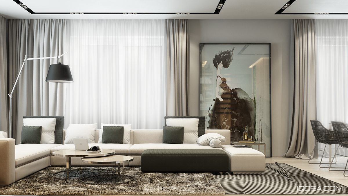
Color is not the only way to make a space visually interesting. In fact, when too many vibrant colors come into play, it is easy for a space to get a busy, crowded, and distracting. This Moscow home, as visualized by Iqosa, instead chooses to stay with a neutral color palette, consisting largely of dark grays, creams, black, and a bit of gold. To bring more visual interest into the space, texture is used heavily throughout the design.
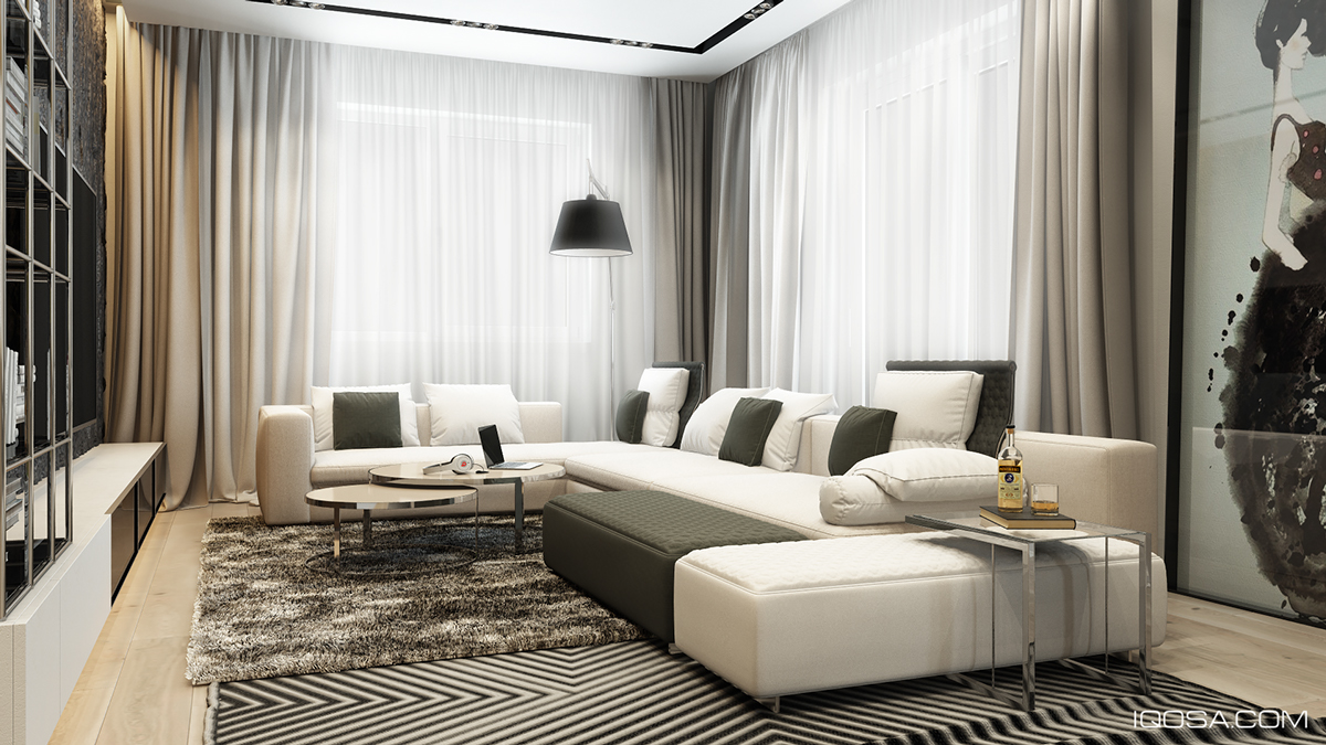
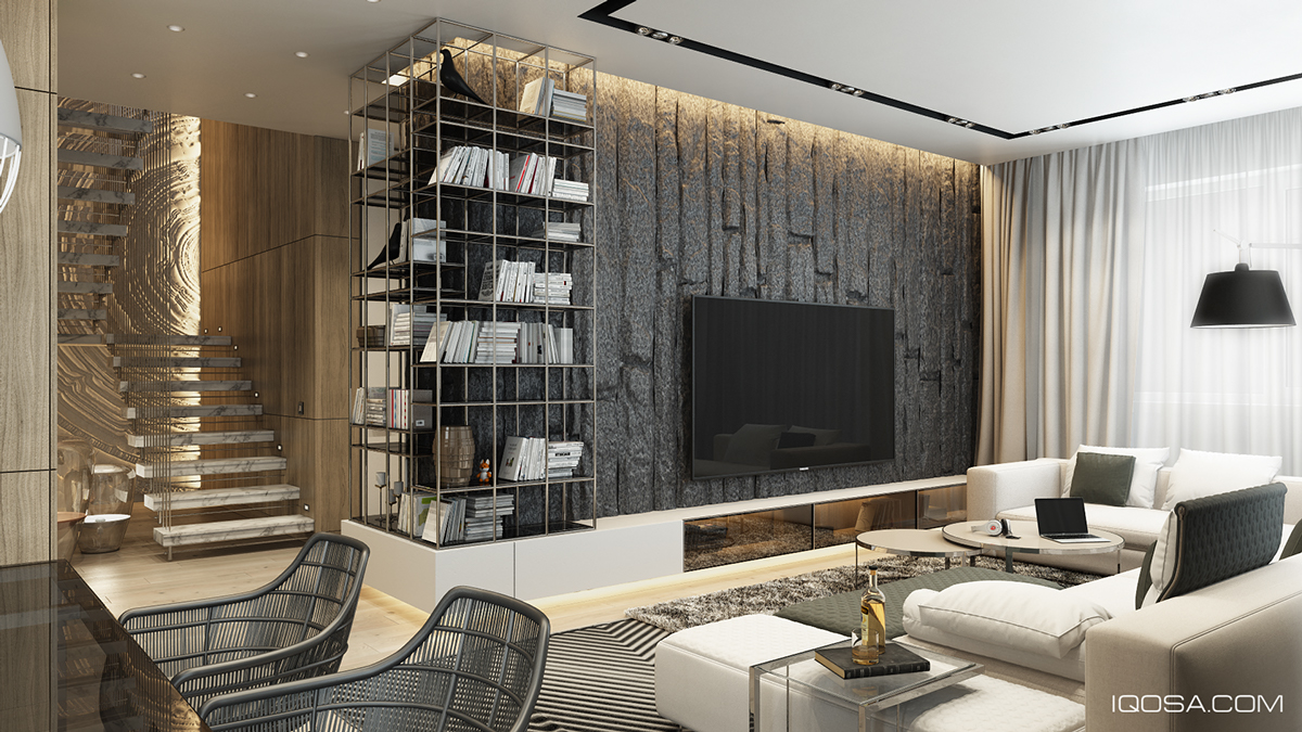
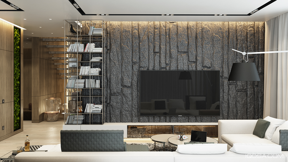
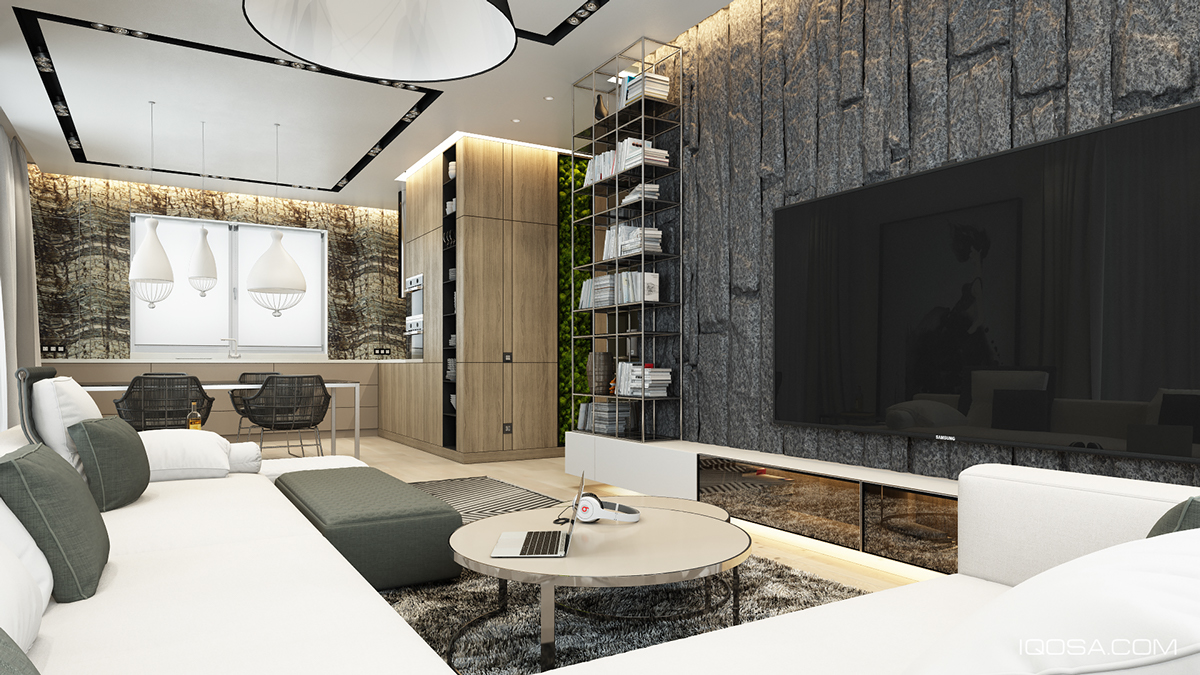
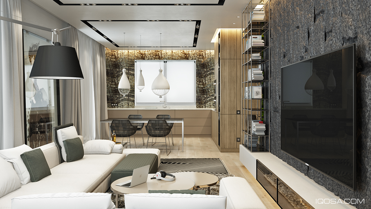
First up is the living room, which centers on a large, smooth sectional sofa that faces a television. The flat panel screen is hung on a craggy stone wall, with the visible texture both helping to camouflage the television and to create an interesting dynamic between the smooth surfaces of the sofa and its opposite wall.
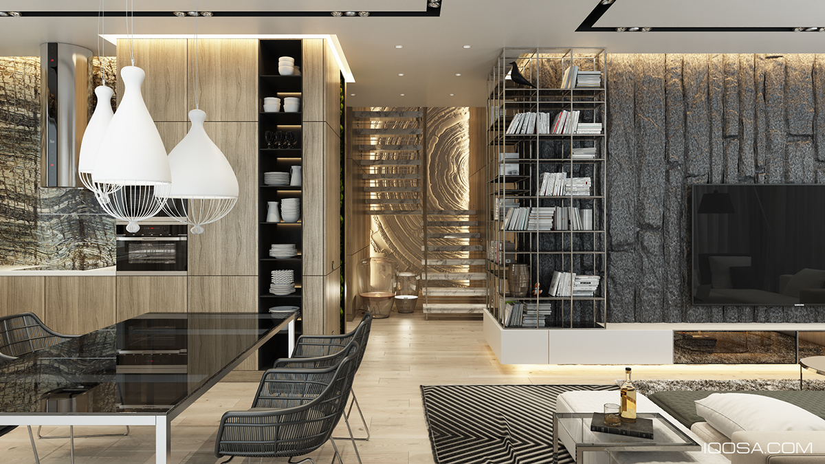
In the adjacent dining and kitchen area, texture continues to weave its way through the story of the design. For instance, the deep dining chairs use a wire frame that takes the place of the standard Eames-style smooth, molded chairs while the table they surround shines with a smooth glass finish.
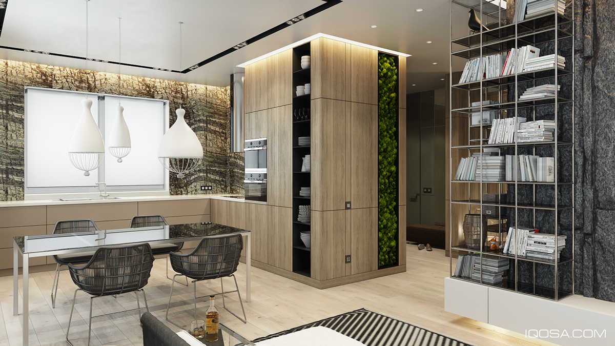
Next to the dining table, smooth wood paneling contrasts with a vertical garden, in both color and texture.


The stairwell is quite interesting as well, with a large wall display behind the actual steps drawing attention away from the practical nature of the space. Lighting gives the wall a gold reflection and makes the stairs all but disappear, making the alcove its own artistic display.


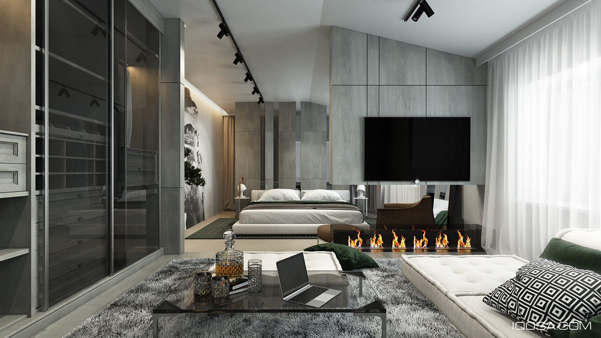
In the bedroom, soft greys and whites are offset by a green indoor tree and a deep kelly green throw across the bed. A larger than life painting brings in a unique artistic element but does not disrupt the palette at all.


The master bedroom also features its own lush seating area with a soft grey carpet, smooth sofa, and modern fireplace with the leaping flames create their own texture as well.


